AARP
Livability Index
Visually redesigned AARP’s Livability Index homepage and their Community Finder Quiz.
Role
Associate Designer
Areas
Visual Design, UI/UX Design
Platforms
Desktop, iOS, Mobile
Official Sites
AARP Livability Index
Community Finder Quiz

Background
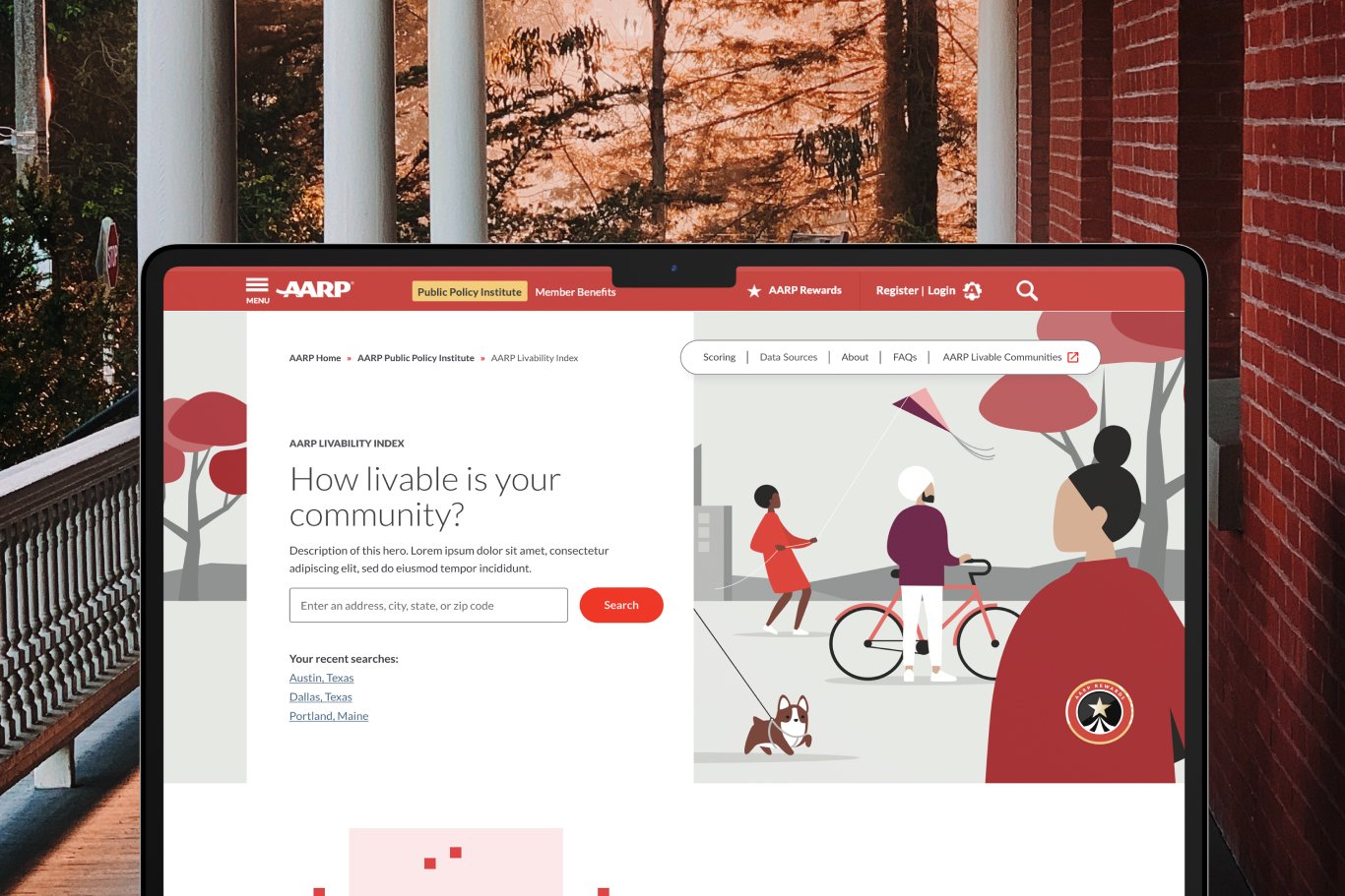
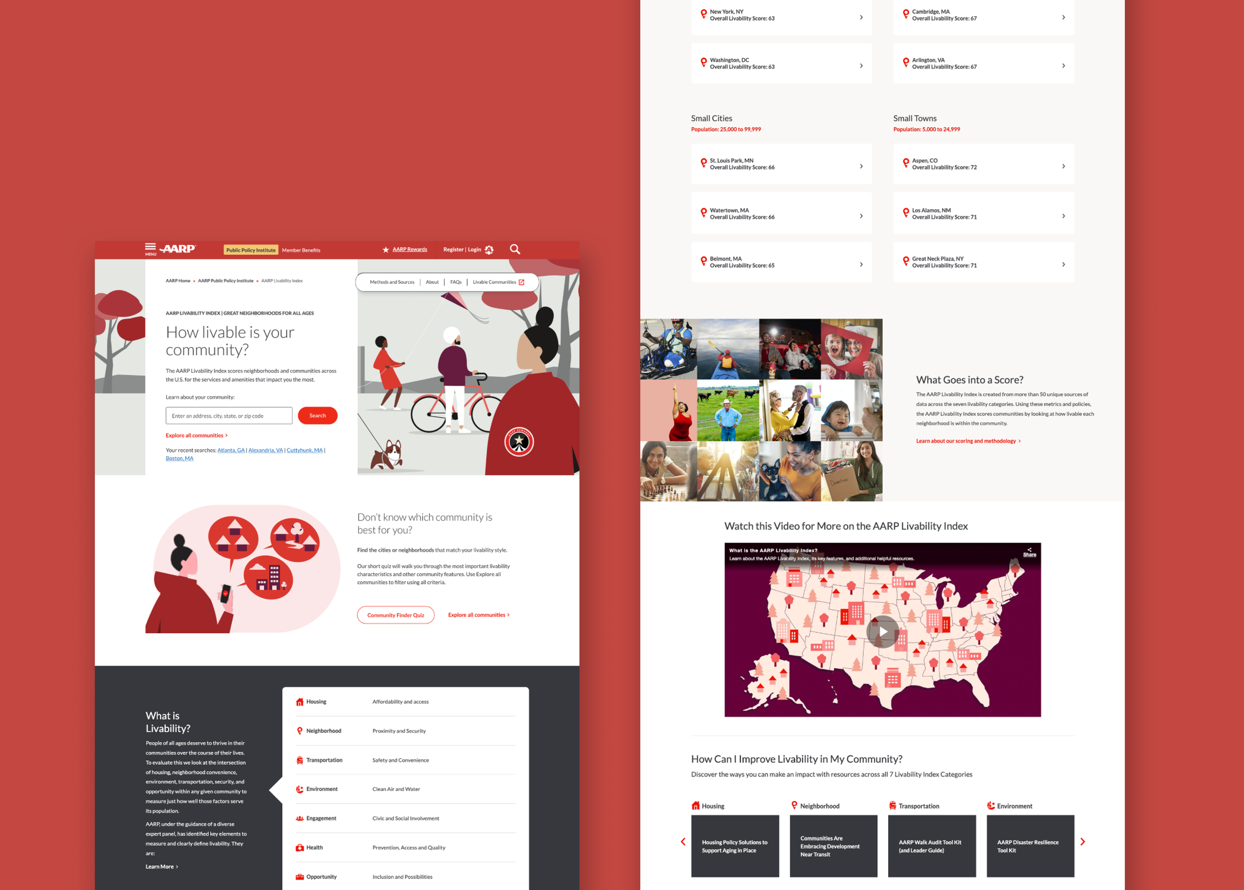
AARP’s original design layout was styled with the intent of being plain and bare-bones, containing straight-to-the-point and no-fuss content. This is not necessarily a negative thing, but when the design layout is plain and lacking, the interest of the site can suffer; especially when trying to attract a newly retiring demographic.
The contrast and overall design quality of the homepage left much to be desired. It was the request from AARP to “lively” up the site, and make it visually appealing; without adding unnecessary bells and whistles that may make it confusing for an older target demographic.
Visual Design Approach
It was understood that we needed to create a visually compelling layout, but leave room for familiarity.
We arrived at the approach of utilizing AARP’s Design System, using their visual icons, color schemes, and illustrated characters to update the new site. With AARP’s Design System as the foundation to build off of, we redesigned the homepage with visual illustrations instead of real-life photography.
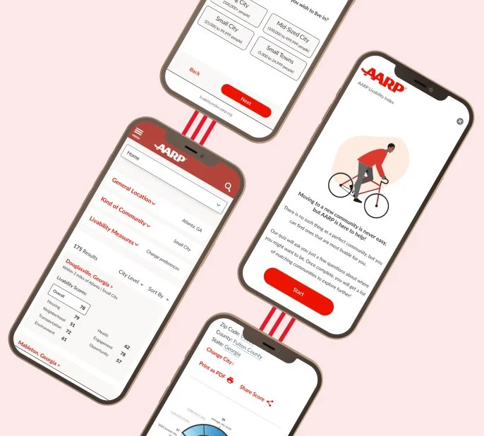
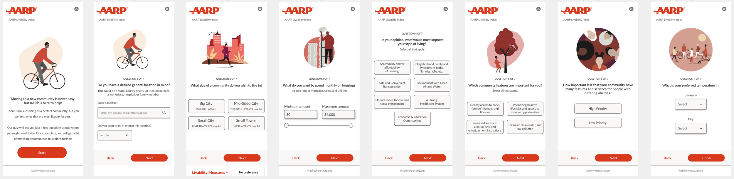
The goal of the Community Finder quiz is to have it help users discover potential housing opportunities within their parameters that they may not have found otherwise.
Impact
The relaunched AARP Livability Index won accolades for usability and design, including Gold at The W³ and Davey Awards, but the greatest impact was in meeting AARP’s goals for a user-focused, accessible tool that would truly communicate valuable information for AARP’s primary audience.
- Excerpt from AARP Forum One