Hertz Design Challenge
Improving the vehicle renting app experience for professionals who frequently travel for work.
Role
Visual Designer
Product Designer
Researcher
Tools
Figma, Photoshop
Areas
Design, Strategy, User Research
Timeline
Jan. 2021
4 hours
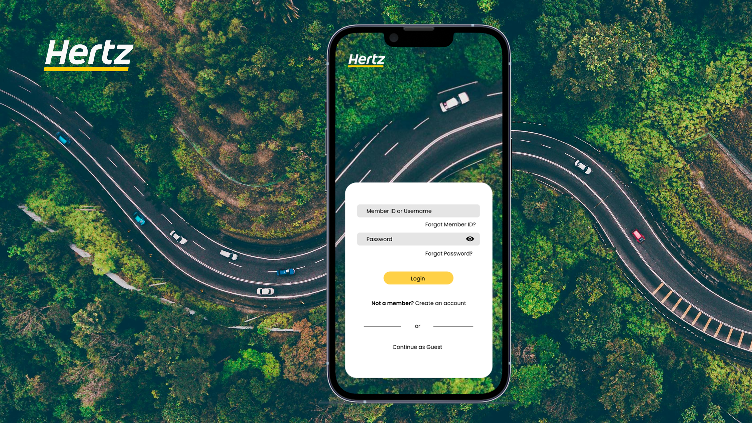
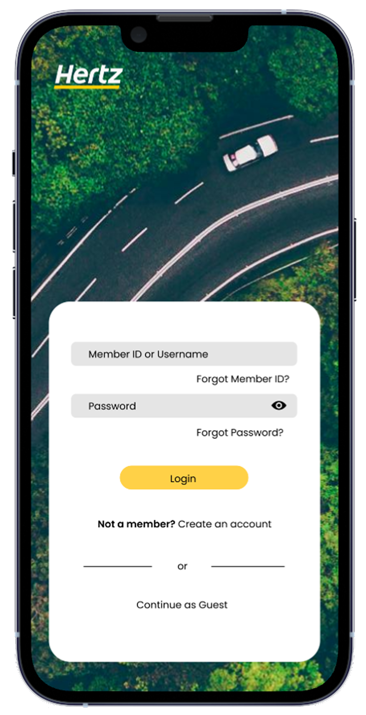
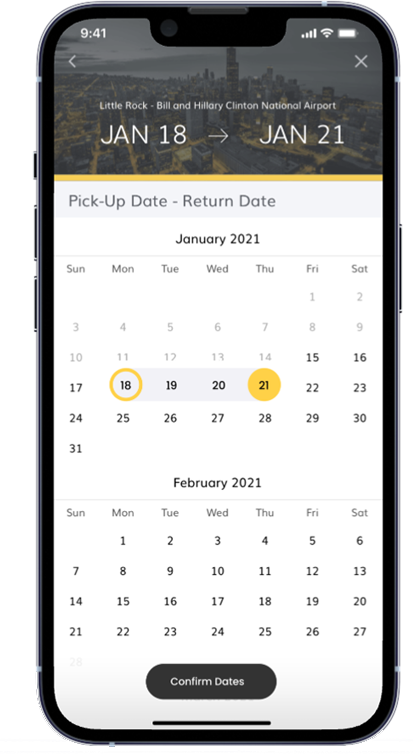
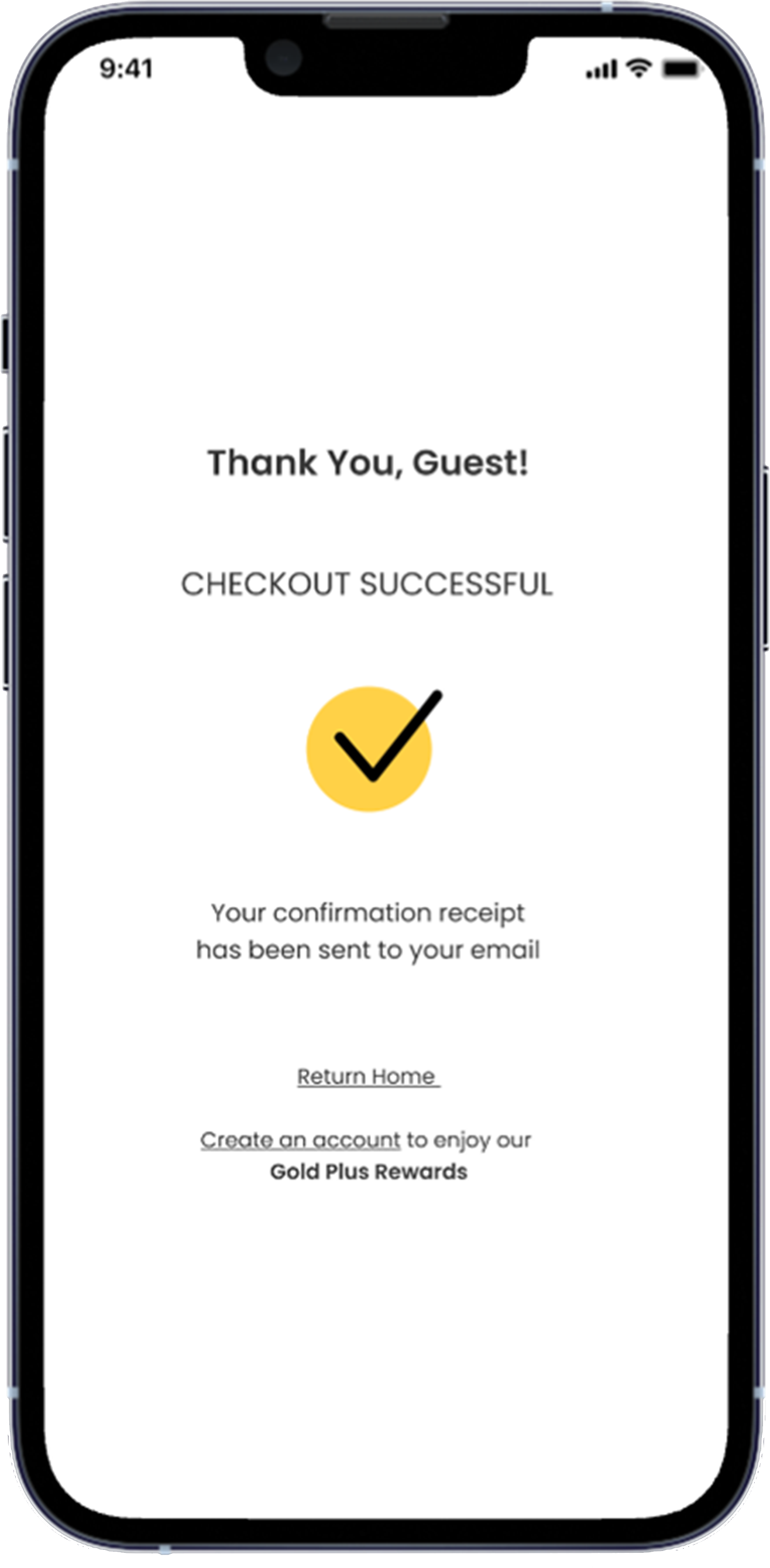
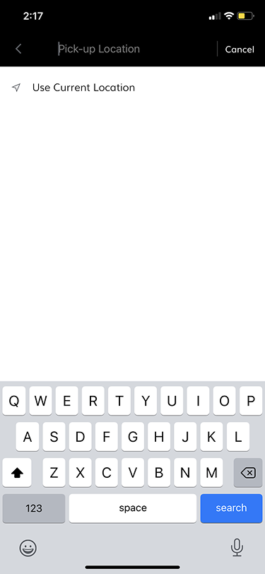
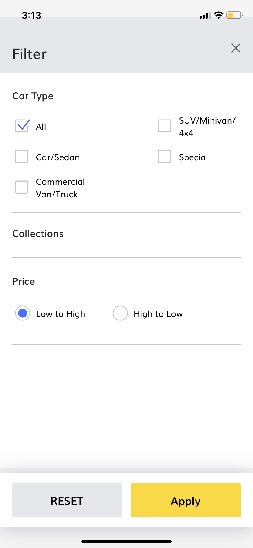
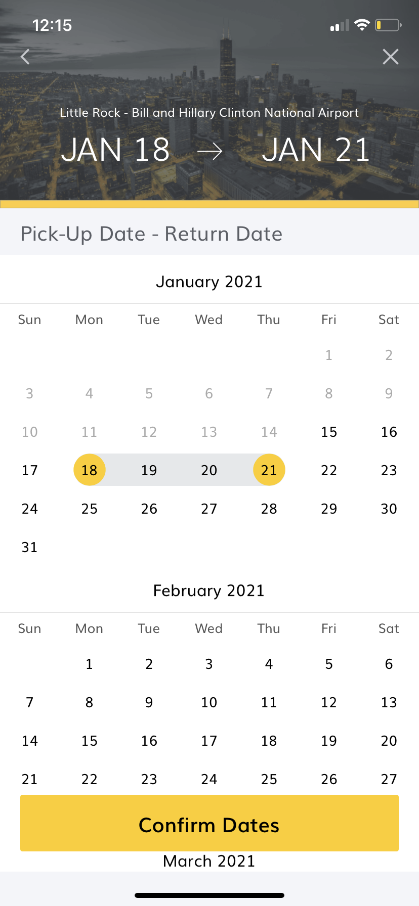
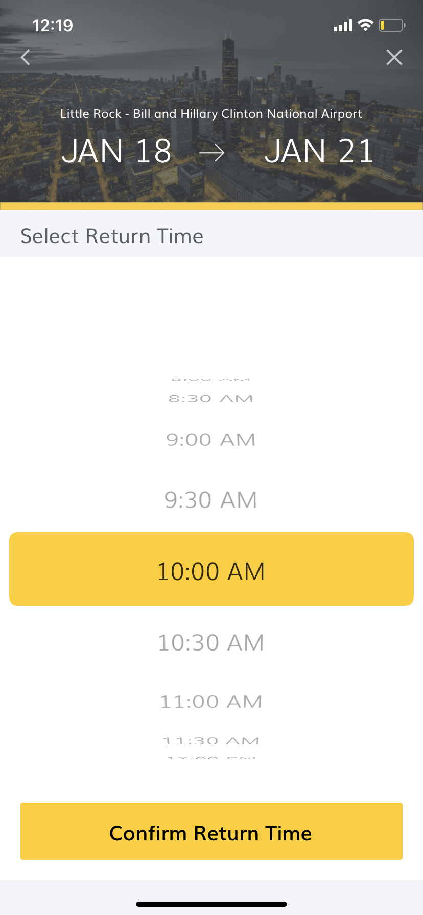
Final Designs


Background
For this 4-hour design challenge, I attempted to create a prototype with a strong visual design layout that would keep the user engaged with the app while still providing the intended goal to a user’s intent, which is to successfully rent their desired vehicle that fits within their budget.
Original Hertz Design
What Needs to Change
Regarding the original Hertz design, I saw that the colors being used were seemingly used as a second thought or overly used in some parts. In this case, it’s not about consistency but about cohesiveness.
We’re aware that Hertz largely uses a black, white, and yellow color scheme, but the current placement of the colors create a sense of disarray, thus making the visual appeal feel a bit off.
User Research Approach
The main challenge of this particular project was the time crunch. I was unsure if it was possible to implement thoughtful research, create preliminary sketches, create wireframes, user test, and finalize everything within the 4-hour timeframe.
To tackle this, I set up an hour-by-hour schedule by allotting specific times for specific tasks and forcing myself to move on to the next specific task as soon as the timer went off. During this challenge, my mantra became, “It does not need to be perfect, it just needs to make sense.”
30 - 35 mins:
Research and Draw preliminary sketches
Build researched visual components
1 hour and 30 mins:
User Testing
Set up clarifying questions for Final User Testing
2 hours:
Develop & Finalize visual components
Make extra time to correct any errors during the process
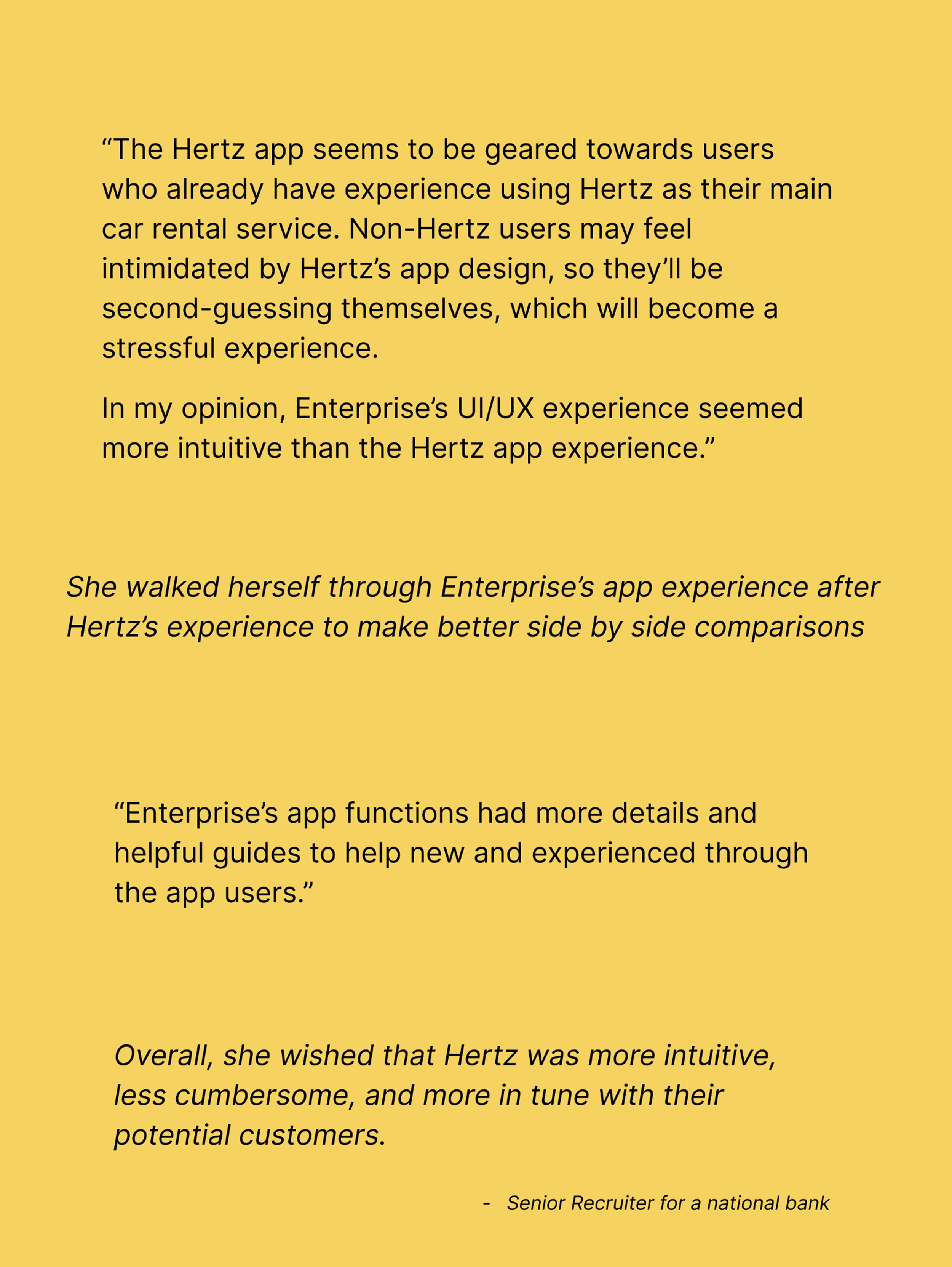
Thankfully, I knew of an avid traveler I could
reach out to instead of solely relying on online reviews.
She is a Senior Recruiter who primarily uses Enterprise for her work travels. She uses the car rental service on a near week-to-week basis.
Here are her thoughts on the Hertz app.

Visual Design
Approach
By using my visual design strengths, I utilized yellow as much as possible throughout the app design. Next, I focused on improving legibility and order, and then implementing helpful techniques to help new users find their way through the app as seamlessly as possible.

Final Prototype
If I Had More Than 4 Hours
Here’s what else I would have done if I had more than the allotted 4 hours to redesign the Hertz app:
Added more visually engaging designs, such as changing the Airport Header to match the location of a user’s destination, and placed simplified iconography throughout.
Designed a progress bar to help the user visualize how much longer they have before reaching the ‘Check Out’ section. Trying to rent a car with your finances can be a delicate and mentally draining process, and adding a progress bar could help users visualize the finish line.
I hypothesize that if users can visualize their progress, they’re able to retain more of their patience and will see the action through rather than quitting the app completely.
However, these hypotheticals are just that, and if I had more time, I would have done extensive user research to confirm if my hypothesis is correct. User Research is imperative to the design process as it allows the Product Designer to create more intuitive, necessary, and cost-effective designs. “
Made the total amount of USD more prominent.
During the 4 hours, I’ve come to understand that while visually powerful designs are important, when a designer is pressed for time, functionality and purpose tends to get prioritized.